Escaping Echochambers
Section: Home / Post
Categories: Machine Learning,
Tags: Machine Learning, Principal Component Analysis, Visualization,
The echochamber effect is a worrisome issue in social media. It risks isolating users in exclusive groups as they repeatedly subscribe to content that reinforces their biases. To keep users engaged, websites expose users to content similar to their history. You will get recommendations for movies you may like, or peoply you may befriend, or communities you may join - all based on some measure of similarity with your profile.
On first glance, this seems convenient: a user does not need to explicitly search for content. The digital platform assumes a user’s wants. You may even be shown interesting things you wouldn’t have known to look for. As users consume more content, their digital footprints become more accurate descriptors of their preferences. It becomes easier to navigate the world wide web: users’ interests are served on a platter. However, this is not a unitateral benefit. An exchange is being made in the currency of data: convenience for autonomy. At some point, users may find themselves in concord with everything they see online. Gradually, all their new Facebook friends share their views. According to news articles on their social feeds, the world seems to be going in the exact direction they predicted. Every new movie recommendation is a romcom - their guilty pleasure. Uncanny.
This is the digital echo chamber. A cocoon spun from our Confirmation bias and cemented by the false consensus created by recommendation systems on digital media. It can progress from a benign exploration of ideas to complete ideological isolation like the one we observe in current political discourse between the Right and the Left.
In the following sections, I discuss how digital content can be processed by way of simple examples, and how recommendations can be generated that counter the echo chamber effect. For illustration, I will use posts on the image sharing site imgur.com as my data points. There are better ways of going about this, no doubt. This write-up is intended as an exercise in applying what little I’ve learned about machine learning. It is also an exercise in avoiding my other committments in life.
The curse of dimensionality
Imagine you are classifying people in your neighborhood. For each person, you take two readings: their age and how long they have lived in the neighborhood. You want to find new friends for your neighbours based on the similarities you find in the survey. You get the following results:
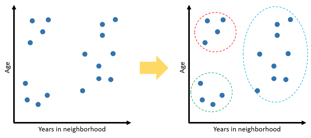
The cluster in the bottom left could be new college graduates who just moved into town for their jobs. The top left could be retirees moving into a nearby retirement community. People on the far right could be some who’ve lived all their lives in the neighborhood, or moved there in their youth. You could hypothesize that people who seem to fall in the same cluster will make good friends. With just two axes, it is easy to visualize data. And it is easy for computers to process it as each datum is represented by only two numbers.
However, describing people just by their age and length of stay is not particularly useful. In this context, their interests are also relevant measurements. So now, your survey looks like this:

Note that the survey is presented as a table and not a graph. Can you visualize data points with several descriptors? It’s hard to visualize information when there are more variables to consider. It’s also less intuitive to make sense of patterns (if you can detect any at all). Computers have it hard too. If, for example, in the first instance, the survey had answers ranging over 50 years for age and duration of stay - then there could only be 50 x 50 = 2,500 distinct points on the graph. But in the second instance, if the survey asks people to rate their interests from 0-100, then for each choice of interests, the distinct ways a person could be represented would multiply by 100! With just two choices of interests, there would be 25 million combinations. This is the Curse of Dimensionality.
Complexity of a problem is exponential in the number of variables.
Moving to the problem at hand: how would you classify digital content like a news article, or any page of text? A simple way is to tally the frequencies of all words that occur. So an essay on European history would have the word “Rome” more times than a story about kung-fu monks. This will help you discriminate between the content of the two data. But there are hundreds of thousands of words, and each can occur any number of times. There would be billions of ways an article could be represented as a data point.
Reducing dimensions
We want to simplify the problem. There need to be fewer descriptors for the data. But it should not come at the cost of losing information. The distinction between data points should be preserved. Consider the survey example. In our first case, there were two axes - descriptors. Can we instead use one and still tell the points apart?
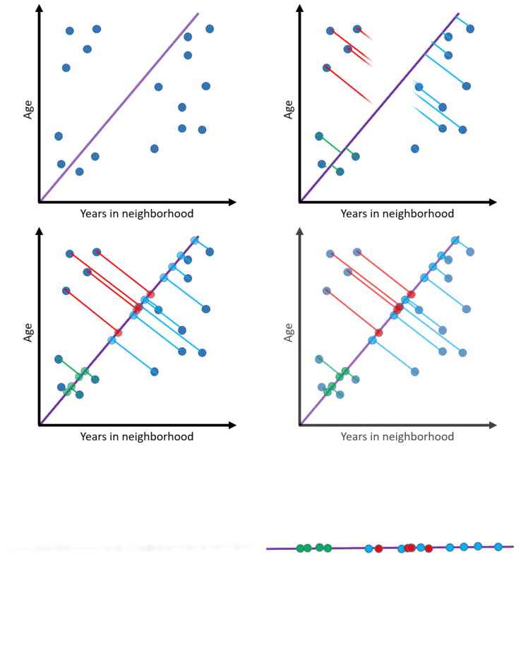
Indeed! Instead of each descriptor corresponding to a single attribute in the data, it can represent a combination of attributes. In the above case, a single axis encodes information about both age and time in neighbourhood such that the points are distinguishable. Note, however, that we cannot cluster points in the same way as before as there is some overlap. This is the cost of reduced dimensions. Tractability comes at the price of lost information.

The new axis is a Principal Component. It is a vector in the direction of maximum variance in the data. Points in that direction vary the most, so when they are projected on the component, it is easier to tell them apart. A dataset can have as many principal components as it has attributes. Each subsequent component points in a decreasing direction of variance. Since the point is to reduce dimensions, later principal compoents are discarded as they only represent smaller and smaller variations.
Mathematically, principal components are the eigenvectors of the covariance matrix of a data set.
Coming to the problem at hand, an article has hundreds or thousands of words. Each word frequency is a descriptor which distinguishes one article from the next. Managing so many dimensions is intractable. We can make the problem easier by finding the principal components of the words in a set of articles. The hope is that other articles, when projected on to the principal components, will be easily distinguishable as well.
How does projection work? Assume the total vocabulary of a set of articles is 5 words: [a, b, c, d, e]. Two new articles come along which have the following word frequencies:
A1: [a: 2, b:1, c:0, d:2, e:5]
A2: [a: 3, b:0, c:0, d:1, e:1]
A principal component is simply a weighed combination of descriptors. Let’s say in our case there is one component:
C1 = 2a + 3b -1e
C1 is a single number. We substitute word frequencies into C1 to get projections of A1 and A2:
PA1: 2(2) + 3(1) - 1(5) = 2
PA2: 2(3) + 3(0) - 1(1) = 5
Notice, now, instead of having 5 separate numbers representing an article, there is a single descriptor: the projection on the principal component. This way, data points with hundreds of attributes can be projected on to a handful of principal components.
Recommendations
Principal Component Analysis has made the problem tractable while keeping the data points distinguishable. Now comes the problem of generating recommendations. Remember, we do not want to recommend very similar articles. That is the entire point: to counter the echochamber effect.
Given a user’s browsing history, how do we measure the similarity of some article to the user’s interest? There are many classification methods in machine learning like Logistic Regression, Decision Trees, and Support Vector Machines. Classifiers can be used to bin new articles into two categories: similar and not similar.
Instead of binary classification, a scale can be used as a measure of similarity. Given a set of points, each an article on the principal components, their weighted average can represent the gist of their content. So if there is a list of points a user visited, their centroid - weighed towards more recent points - will convey that user’s profile so far.
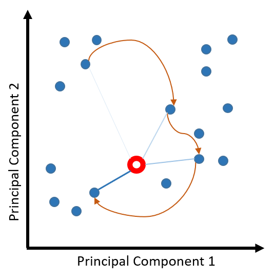
That centroid can be a reference for future recommendations. Points falling farther away will be recommended more. When a user visits another point, the centroid will shift - depicting a change in the user’s interest - and so will the recommendations.
Echochamber in action
All the building blocks for a recommendation system are in place:
- Use a set of sample articles to get principal components.
- Project data on to principle components to reduce dimensions.
- Track user history and calculate weighted centroid of visited articles.
- Generate recommendation scores for other articles based on distance from centroid.
I wrote a simple application (called Echochamber - imaginative) built on top of a machine learning library I’ve been working on imgurPCA). The app uses user comments on imgur to generate principal components and to analyse posts.
The following illustrations use two components, comprised of 200 words, generated from the top posts on imgur for the past year. The points plotted are a random assortment of posts that reached imgur’s front page on the day I captured the data.
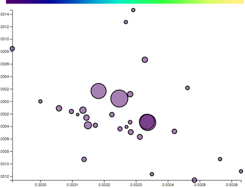
Notice that the points (i.e. imgur posts) are reasonably spread apart on just component to the following. This will also show how “political” some posts are:
trump:1 hillary:1 obama:1
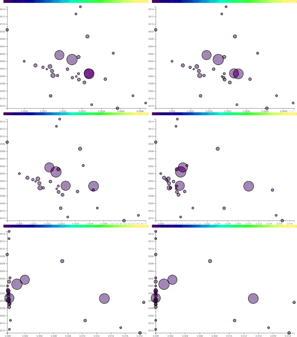
The posts that drift to the left do not have these words. The posts that remain or drift further right have more. Manually selecting axes has its benefits and drawbacks. By choosing projections, you can sift through the data at your leisure and find patterns. On the flip side, the points may lose their distinction.
As a user browses posts, their history is kept and a centroid is calculated repersenting their general interest. Based on the distance from the centroid, other unvisited posts get a recommendation score:
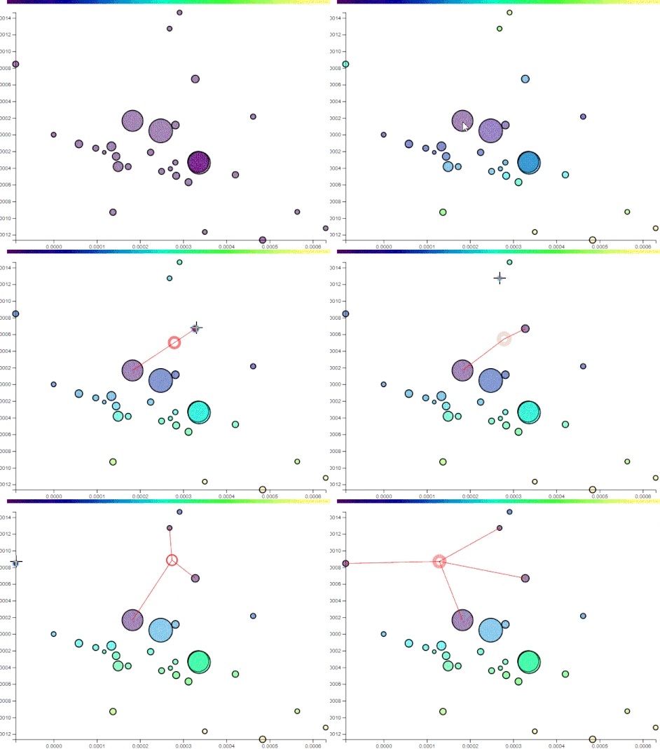
The recommendation scale is the bar at the top. Posts with yellowish hues have the highest recommendation based on the user’s profile so far.
Use cases
Echochamber may be used with crowdsourced anonymous data or individually. One application would be to see how a user’s profile compares to their network on social media, or to the world at large. Different principle components derived from different sources will have different projections. A user could place their interests on axes generated from scientific articles, or from news stories. Each set of components will give users an idea of their shpere of knowledge. The hope is that they’ll be able to see if they have fallen prey to false consensus.
A website may use similar strategies to diversify a user’s recommendations of connections and content. Of course, the fiscal returns on showing content not necessarily agreeable to users are questionable. Barraging climate change skeptics with global warming articles may turn them away from a website and lower revenue. But if we are to have meaningful discourse, we must stomach contrary opinions.
How to run
The setup process for Echochamber is not user friendly, particularly if you are unfamiliar with programming and using command-line interfaces.
First, install git and python 3 on your computer. Then open your command prompt and clone the repository:
| |
You’ll need to have some dependencies installed. In succession:
| |
Also you need to obtain keys from imgur so you can access their data. Go here to register the application and get a client secret and id. Create a file called myconfig.py in the cloned repository folder like so:
CID = 'CLIENT ID'
CS = 'CLIENT SECRET'
Finally:
| |
This will print out help for the application. The first order of business is to create your own set of principal components:
| |
This will download 100 top weekly posts from imgur and create 2 principal components from them using 200 words (after filtering out common words in filter.txt). You can use the --query flag to use a different set of posts from imgur. However, you’ll need to be familiar with the API and the Query class from the documentation.
To see it in action:
| |
Then open your browser and go to localhost:5000. Viola!
Future work
I plan to use sources in addition to imgur for analysis. The base library imgurPCA is modular and lets me plug in different back-ends for the same interface. I may just parse search engine results, or use a news site’s API.
The recommendation algorithm is simplistic. In the future, I plan to employ more rigorous approaches like regression, clustering etc. for better classification. My current academic research is in reinforcement learning. I may play with the idea of using intelligent “rebellious” agents that diversify a user’s browsing experience.
Conclusion
Today’s world is interconnected as never before. Yet we are ideologically stratifying at an ever increasing rate. It is in part due to us seeking immediate gratification in perusing familiar content that is readily at our fingertips. And it is in part due to us surrendering our digital autonomy to algorithms that farm our preferences for clicks. Now is the time to introspect - to mitigate the symptoms of digital echochambers before they burgeon into an epidemic of historic proportions.